Jacob Burgess
Jacob Burgess
©
Jacob Burgess
2024
Connecting Compassion
A Website Design

Overview
This project was created to update an existing website for a local non-profit called Children and the Earth. Their charity focuses on fundraising money to help families pay for surgeries for their children when their lives are at stake.
Since this charity is so generous and good, I felt that they deserved a new website design to match it.
I designed this website on mobile, tablet and desktop so that it would match each screen size.
The audience for this project is the Children and the Earth employees and anyone that reaches out to them for help. By redesigning this website they can now navigate and get information across easily.

First Impressions
One of the first things that stuck out to me when I started researching Children and the Earth is how bad their website is.
They have lots of images that are cropped wrong and overall it looks like it hasn’t had an update since the turn of the century. A lot of it is really hard to navigate as well, especially with all of the past recipients pages on the right side. I thought the information on the page was really good, but needed better presentation and navigation for it to be more effective, which is what I focused the majority of my design on improving.

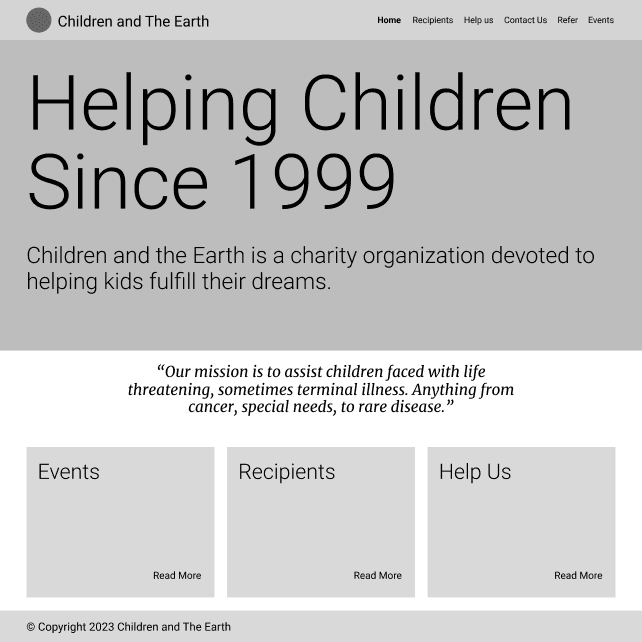
Wireframes
The biggest change that I made off the bat was navigation. I noticed that their original website had three different navigation bars, as well as tons of links and photos to other things. I decided that to improve this I would make only one navigation bar and just include some basic information about the charity for the main page rather than overloading it.
I also noticed how almost all of the information on their site was about events, recipients and helping them, so I chose to include those main topics with images inside of them on the main page.

Final Design
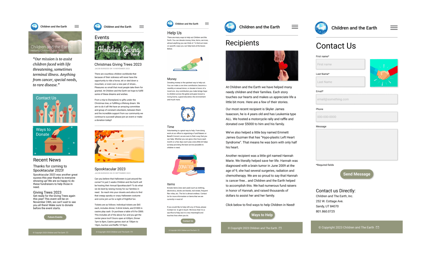
After going through each of the pages and making wireframes I finally went back and added color and images.
Some of these pages needed more work than others, and everything needed a major refresh of information since some of it hasn't been updated in over a decade.
Children and the Earth is an incredible organization that is deserving of an incredible website. This project helped to design a website to further their mission to help children and families in need.
I really liked the way the design turned out and think that users would love the new look and navigation of the website compared to the old one.

Here is my prototype if you would like to take a look at it!
First Impressions
One of the first things that stuck out to me when I started researching Children and the Earth is how bad their website is.
They have lots of images that are cropped wrong and overall it looks like it hasn’t had an update since the turn of the century. A lot of it is really hard to navigate as well, especially with all of the past recipients pages on the right side. I thought the information on the page was really good, but needed better presentation and navigation for it to be more effective, which is what I focused the majority of my design on improving.
Connecting Compassion
A Website Design
Jacob Burgess
©
Jacob Burgess
2026
Jacob Burgess
©
Jacob Burgess
2026